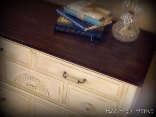
My sweet sister wanted a piece of furniture for the end of her bed. We discussed a bench, but finally settled on a cedar chest so she would have someplace to store her stacks of fabric (she’s an amazing seamstress). She found this chest through the on-line classified ads for only $30, and I picked it up for her:
It’s a good Lane-brand chest, and it even still has the key! The top is all cedar-lined, and the bottom has a drawer. She pretty much gave me carte-blanche to fix it as I liked, but I knew she liked the wood top/painted base combination.
So here’s what she got to take home!
The top is stained with Minwax Antique Walnut stain. I was at the very end of the can—and I found that it gets very thick at the bottom if you aren’t good about stirring it before each use (obviously I didn’t!). It actually gave a new and different effect to the top of the chest. In some places, the stain went on almost like paint, and could be sanded off to leave interesting lighter streaks. I kind of liked it!
I chose to change the hardware on this piece (I found the new pulls at Hobby Lobby), which involved filling all the old holes and drilling new ones. (I swear, sometimes that process takes as much time as the painting does!)
I like how the fluted shape of the knobs echoes the shape of the fan.
The base, by the way, is painted in Behr Ultra paint. I had them color-match Sherwin Williams “Creamy” paint.
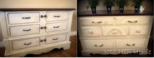
I don’t have any “before” pictures of this next chest, but I thought I’d toss the “afters” in here for comparison’s sake!
As you can see, this chest is very similar (it also has a bottom drawer), and it received almost the identical treatment.
The knobs and pulls were interesting on this piece. They were a Southwestern style, had a very brassy finish, down to a faux green tarnish in the details. What is a Southwestern style knob, you ask?
Well, imagine a knob that has a stylized fish carved into it! It was not my favorite look, even after painting it all with Krylon’s oil-rubbed bronze spray paint. I replaced all the knobs with plain round knob from my stash. (I kept the pulls. They have some angular carvings on the ends, but I could live with them.)
I adore cedar chests!
Here are the two side by side:
Which one do you like better? Why?
*********************************************************
This project has been featured at West Furniture Revival.
Linking up here!


33 comments:
Both of them are just wonderful. You did such a great job and both chests are a beautiful style. Love them. Hugs, Marty
These are the perfect pictures to start a design discussion with my husband. He loves the one on the left and I love the one on the right. ;) They are both beautiful!! Great job!
Great job on both of them. I like the one on the left.
Holly
Love both...if I had to choose a favorite....I would pick the one on the left. I think because of the hardware.
I like the newest one you've done best (right) I'm not a fan of the round knobs in the middle of the other piece. (are they needed? Just wondering)
I am such a fan of the light paint and the stained wood. I have noticed some catalogs are doing that now... have they always? (arhaus is the one I noticed)
have a great weekend, super job girl! (as always)
gail
I think I like the one on the left better, but I couldn't tell you why. Symmetry, maybe?
They're both really pretty, Korrie!
They are both amazing. You did a really nice job on them. I like the one on the right only because it is more my style of furniture. Wood and White is always a great combination.
they are both gorgeous, but i think i am leaning towards the one on the left because i like the symmetry. :)
I.Heart.This.
Love, love, love.....I totally want to re-create this but I am soooooo scared to refinish furniture. :(
Fantastic tables! You always have the best projects to show! Love it.
Shoot...I couldn't pick a favorite out of those two beauties if my life depended on it. They are both awesome.
I have a cedar chest..no hardware or anything on it..I got it for Christmas when I was 15 yrs old..(I'm now 73) and it is sooo ugly, I don't think painting it would help. It sits at the very back of a walk in closet..when I was 15, however, it was the prettiest thing I had ever seen. :))
I like them both too! I prefer the knobs on the right, and the "fan" piece of wood. I would enjoy looking at those more, so if I had to choose... the right!
really like both of them, but definitely, the one on the right is my favorite. I think it is the color and the hardware combined with the fan piece on the front. Seems to have a softer feel to me.
Well, the one you just did for your sister (right) is my favorite! It's definitely my style & I like the fan design on it. Just seems to have more texture. Outstanding job on both!
xo
Pat
Love them both! Your so talented!
Like them both but my favorite is the one on the right. I think it's because of the detail of the fan shaped decoration. I'm also not a big fan of the double knobs in the center of the other chest - I like knobs to be useful and the double knobs don't seem to have a use.
Oh Korrie,
They are both very lovely. You did an awesome job on both...Bet your sister absolutely loved, loved, loved hers :-)Can't wait to look around your blog some more...Have a wonderful day.
Hugs and Kisses,
♥Ana
They both look great, but I love the symetry of the one on right!
i think they both turned out beautful. im a big fan of the stained top with the painted base..
great job.
These are both gorgeous! I like the one on the left best because I'm all about symetry.
Nice work! :)
They both are awesome. They have different 'feels.' The second one seems more utilitarian, simple lines...amazing hardware. The first one is more feminine and is well suited for a bedroom. Just catching up on my weekend reading. Glad I saw this one!
I love them both, each different in their own unique way! Love how they look and I would love to do something like this on 2 end tables I have in my den...
Hugs,
Debbie
I think you did a wonderful job on both!
Hope you will please drop by and enter my $50 Overstock.com Gift Card Giveaway!! If there are 500 entries, they will increase the Gift Card to $100.
Honey
They both look great but I really like the one on the left. The hardware and arrangement on it is awesome
Coley
www.whatyoumakeit-coley.blogspot.com
Beautiful job on both of them. I am swooning over the first one with the fan detail. Thanks for sharing.
Both of these chests look wonderful! You did great.
Be a sweetie,
Shelia ;)
Gorgeous chest! I love the shell on the one it really accents it. You are really great at picking the pieces and refinishing.
What a deal!!! A Lane chest for $30! You did a great job on both pieces...you are a very good sister. I get a little confused about all the knobs and pulls on the simpler chest so I vote for the Lane chest.
Oh Wow! Both cedar chests are gorgeous. You did a beautiful job on them. My cedar chest is 46 years old and I just can't bring myself to paint it. But after seeing yours, I am really tempted. Thanks so much for sharing. Karie
They both look gorgeous! I like the oil rubbed brass color of the dresser on the left but I am drawn to the scalloped wood on the right. Great great work! I am so inspired!
They are both wonderful and you did a great job transforming these. Thank for joining the Open House party this week.
xo,
Sherry
LOVE THIS YOU CRANK THESE BABIES OUT AND EACH ONE IS JUST AS GOOD AS THE LAST.. I WOULD LOVE TO FEATURE THIS . IF THATS OK LET ME KNOW
LAUREN
Post a Comment