Friday, May 25, 2012

Beadboard Flag

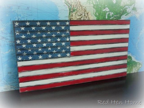
I have been neck-deep in home projects again the last few days, but in honor of Memorial Day, I wanted to show off a beadboard flag I made!

shutters 037

When my last Pottery Barn catalog came, I had actually turned down the corner of the page with their huge $129 flag on it (click on the picture for a link to their website):

Painted American Flag Wall Art

So it was funny that a few days later, a lovely woman (for whom I have made other signs) asked if I could copy it for her!

My version is 48” long x 27” tall, and made out of beadboard.

shutters 038

Wishing a Happy Memorial Day to you all, gentle readers! 

Thank you for those who have served our country, or who have supported family members who have!

Linking up to these great parties:

**********************************

This project has been featured at Better After, Sisters of the Wild WestDomestically Speaking and

******************************************

Linking up here:

 Domestically Speaking Elizabeth & Co.
Sisters of the Wild West The CSI Project
Friday Remodelaholic 2805
My Simple Home Life’s Simple Creations Friday Miss Mustard Seed’s Furniture Feature Friday
Funky Junk’s Saturday Night Special The DIY Show Off
Beyond the Picket Fence Someday Crafts
Knick of Time My Uncommon Slice of Suburbia
Perfectly Imperfect {Primp}
Simply Klassic Sundays My Repurposed Life
From My Front Porch to Yours Itsy Bitsy Paper Scraps
Cowgirl Up! {aka} design

Monday, May 21, 2012

Office Project: The desk!

desk 029

I have no excuses.

It has taken me forever (well, at least a week) to blog about the desk—and for no good reason, other than that it has taken me that long to take and edit a few pictures.  But the time has come…

You can see my concept drawing for the desk here, and the technical drawings here.

It took me two trips to pick up all the pieces of the desk from the talented craftsmen at Sean’s Woodworking in Salt Lake City.   Have I mentioned that it’s NINE FEET wide??  Go big or go home, I say!

They would have been happy to bring it to me and install it for me—but that version is for people who have more money than time (that’s not me).  But never having installed cabinets before, I really didn’t know what I was up against!  So here’s a quick re-cap, if you’re interested.

Because I was going to be installing things myself, they built the upper cabinets with a cleat system, so they could be briefly hung on the wall on a 2x4 until I could screw the cabinets themselves into the wall.  This was a very good thing.  Otherwise, it would have taken a fair amount of juggling and weight-lifting to get everything up and level!

I carefully marked my studs, and first screwed the cleat for the bridge unit into them.  Then I discovered that the cleats for the bookshelves on either end did NOT transverse two studs!  That was not a happy moment, and that’s why the cleat is crooked in the picture!  I ended up using drywall anchors to secure one end of the cleat.

front room to office 002

I prevailed on a neighbor to come help my husband and I lift the bridge unit up onto the cleat—it was heavy!  Then I screwed it into the wall.   The side pieces we could handle on our own!

I posted this “sneak peek” on Facebook the day we were installing it!

front room to office 005

I ran into a few snags on the installation.  This desk is meant to be used for a computer, and so we needed holes for cables/cords to pass through.  When I picked the desk up, I was supposed to have them drilled—but we all forgot.  They assured me I could do it myself, but it was really NOT an easy project.

For example, drilling though the desk top involved drilling through TWO 3/4” pieces of wood, plus a 3/4” piece of MDF!  It took a good 20 minutes to get through all that.
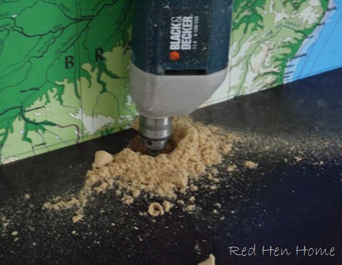
front room to office 009

…but at least I learned that the desk was sturdy!  Yep, I climbed on top of it.  And really—it was easier to do that part than the two holes that had to be drilled in the sides of the cabinets below!

front room to office 013

But drilling the holes was only part of the solution—you see, there are DRAWERS under the counter top, and thus there was no where for the cords to go.

front room to office 006

My solution was to knock off the back of one of the drawers, cut the drawer bottom down my 3 inches, and reattach the back of the drawer.  It was a little hard on the MDF…
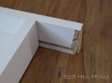
front room to office 008

…and trust me, it was emotionally difficult to break part of a brand-new and expensive desk!

Next problem was due to a bit of a miscommunication, I think.  I requested a pull-out shelf in the right-side cabinet for my printer.  They built me a drawer inside the cabinet:
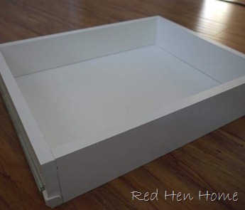
front room to office 016

The difference was that my printer wouldn’t fit in the drawer!  So I took it out to my table saw and sliced off the top three inches all around—thus creating my own shelf.

front room to office 017

Not so pretty, maybe, but it worked!

So here’s a brief tour of my favorite features:

** My printer is tucked away, with space for paper as well!

desk 022

** The CPU is also tucked away, but in a prettily vented cabinet (I got the idea to use decorative sheet metal from Meridian Road).

desk 024

** I love the upper bridge.  I gave up on seeded glass (it was expensive).  The cabinets look like they open upward, but that’s only because of where the pulls are installed.  Upper hinges are VERY expensive, so this was a great cheat!

desk 027

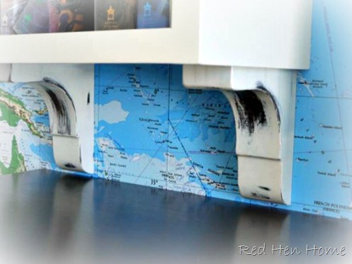
**  I love the corbels under the bookcases, but I will admit that they are not as eye-catching as I hoped they would be.  But I love them because Sheri from Sean’s Woodworking let me come to the shop and help paint and distress them (more on that another time).
desk 025

So there you have it!  It is, without a doubt, the “most major” part of the whole “front-room-to-office” project.  There are still more things to be done in the room—a couple of furniture pieces to finish, and I’d like a rug—but we’re actually using that poor unloved front room now!

desk 020

And I am happy to say that I actually like having the computer there.  It’s easier to keep track of what the children are doing, more convenient for me to use, and best of all…

desk 028

…it’s pretty!

******************************

P.S.  The Map Wall may be found here.

************************

This project has been featured at My Repurposed Life and Primitive & Proper.

***************************

Linking up here:
  Elizabeth & Co.
Sisters of the Wild West No Minimalist Here’s Open House Thursday
Friday Remodelaholic 2805
My Simple Home Life’s Simple Creations Friday Miss Mustard Seed’s Furniture Feature Friday
Funky Junk’s Saturday Night Special The DIY Show Off
Primitive & Proper Thrifty Décor Chick
  My Uncommon Slice of Suburbia
Perfectly Imperfect {Primp}
Simply Klassic Sundays My Repurposed Life
From My Front Porch to Yours It’s So Very Cheri
Cowgirl Up! {aka} design

Monday, May 14, 2012

Office Project: Plank Wall

I already showed you the map wall for my front-room-turned office project…but that is not the only wall that got a makeover!

Were you able to guess what I did from this picture?

map wall plank planked wall

Probably not!

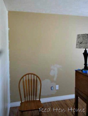
Well, let’s back up a little bit.  This is the wall you see when you walk in my front door (remember…no “entry” in our house).  Not very exciting, is it?

frontroom 010

Well, inspired by Miss Mustard Seed’s guest room

and Thrifty and Chic’s dining room,

I decided to plank it!

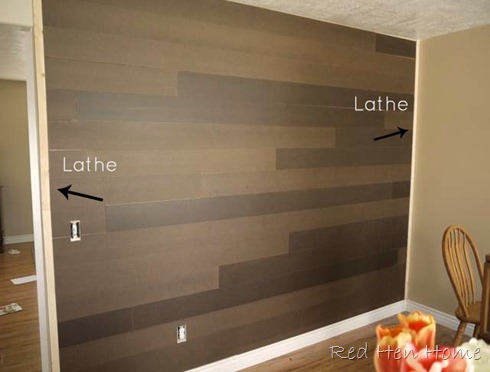
Here’s a brief description of what I did.  I used a lathe strip (leftover from my “green tree” sign project) to define the left edge of the wall.  I decided not to mess with planking the overhead beam for the doorway.  But you know what?  Right this minute—I think I just decided that I regret that!  I may have to go back!  Yeah, like that will ever happen.  I also marked every-other stud line on the wall with a pencil.

house projects 001a

I purchased three 4’ x 8’ sheets of 1/8”-thick hardboard from Lowe’s.  They were about $8.50/sheet, making this a very inexpensive wall treatment!  I had the nice man at Lowe’s cut them into 6” x 8’ strips.  He was able to do all three sheets at once, so it really didn’t take as long as you might think!  Note:  In my experience, Lowe’s has a much more liberal cutting policy than Home Depot does!  But I love both stores.

plank planked wall hardboard

Then I simply butted the left side of the boards against the lathe strip, and nailed the boards into the studs wherever I could.  I did NOT choose to use any glue.  That way, this is only a semi-permanent wall treatment.  I don’t like to think of how many nail holes I’ll have to fill when I decide I’m tired of it…

I know it’s silly, but I was exceedingly proud of myself for notching out the spaces for the light switch and electrical outlet.

house projects 005

Almost done!  I had to rip the last board down to fit.  I didn’t even have to take off the baseboards!

hardboard plank planked wall faux

I covered the right end with another lathe strip, to hide the uneven ends. 

faux plank planked wall

Then I painted the wall with one coat of primer and two coats of Behr Ultra paint (color match to Sherwin-Williams Creamy).  Another note: the nice thing about the 1/8”-thick boards was that I was able to use the same switchplate and outlet plate covers.

faux plank planked wall

Planking that one wall (it’s about 10’ wide x 8’ tall) took about three hours in the morning—and yes, I did it ALL by my lonesome.  Those kitchen chairs that keep appearing in the pictures are what I walked across from one side of the wall to the other!  The painting and priming were done by the time my husband got home from work, so it isn’t too bad of a project. 

house projects 016

I also put up the wall mural on the same day, also before my husband got home from work! 

But when he did get home…I sent him to KFC to pick up dinner Winking smile

house projects 018

There will be some more things on the wall eventually—but I always knew I wanted this great metal clock in there, so it went up right away!

Next installment:  installing the desk!

Linking up here:
Coastal Charm’s Nifty Thrifty Tuesday Elizabeth & Co.
Mod Vintage Life No Minimalist Here’s Open House Thursday
Friday Remodelaholic 2805
My Simple Home Life’s Simple Creations Friday Miss Mustard Seed’s Furniture Feature Friday
Funky Junk’s Saturday Night Special The DIY Show Off
Primitive & Proper Thrifty Décor Chick
Cowgirl Up! My Uncommon Slice of Suburbia
Perfectly Imperfect {Primp}
Simply Klassic Sundays My Repurposed Life
From My Front Porch to Yours It’s So Very Cheri
Common Ground {aka} design

Friday, May 11, 2012

Office Project: Map Wall

When last we visited my front-room-turned-office project (seen here), I left you with a little teaser of the wall treatment for the desk wall:

map mural wall

Yeah, I’m kind of ornery that way!

I really wasn’t particularly planning on doing something special that wall, except maybe painting it a to-be-determined accent color.

But there I was, minding my own business, and my latest Pottery Barn catalog arrived…and there was this picture:

image

Oh, I fell…and I fell hard!

Oh, how I love the look of that map-covered wall.  The problem?  The Pottery Barn decals are $129 each, and to completely cover my wall, I would need…four

Yeah, that’s a little out of my budget!

I will spare you the details of my long and exhaustive search for a reasonably-priced alternative, and just share the good news…

I found one!

Target carries a map wall mural for about $89.  With an on-line coupon code and free shipping, I was able to get it for about $80—and it’s 8’8” x 13’!!  (It’s also easily trimmable.)

Can I get a woo-hoo??

So I ordered it.  And here I am “testing it out” by holding pieces of it to the wall with painter’s tape!

Target map mural wall

I think…I like it.

Here’s the kicker…the wall mural comes in 8 sections.  They are NOT pre-pasted, although the mural does come with some mix-it-up-yourself paste.  I have put up a fair amount of wallpaper in my time, but pasting your own is a MAJOR PAIN.  After a panel or two, I discovered it was better to paste the panel AND the wall, but it was still really, really tricky to get everything to line up.

Since the desk is going on this wall, I am counting on it to cover my flaws!

Here are the first two panels in place:

house projects 011

And here’s a peek at the completed wall!

map mural wall Pottery Barn knock-off

I think it’s an improvement over what I started with, don’t you?? 

house projects 010

And here’s a peek at the adjacent wall…more on that to come!

  (hint:  no matter what the picture looks like, it really isn’t just painted white!)

map mural wall Target Pottery Barn knock-off

***********************************

This project was featured at Simply Klassic Sunday.

***********************************

Linking up here:

Coastal Charm’s Nifty Thrifty Tuesday Elizabeth & Co.
Mod Vintage Life No Minimalist Here’s Open House Thursday
Friday Remodelaholic 2805
My Simple Home Life’s Simple Creations Friday Miss Mustard Seed’s Furniture Feature Friday
Funky Junk’s Saturday Night Special The DIY Show Off
Primitive & Proper Thrifty Décor Chick
Decorating Insanity My Uncommon Slice of Suburbia
Perfectly Imperfect {Primp}
Simply Klassic Sundays My Repurposed Life
From My Front Porch to Yours It’s So Very Cheri
Common Ground {aka} design

Thursday, May 10, 2012

Spring Suitcase Wall

house projects 019

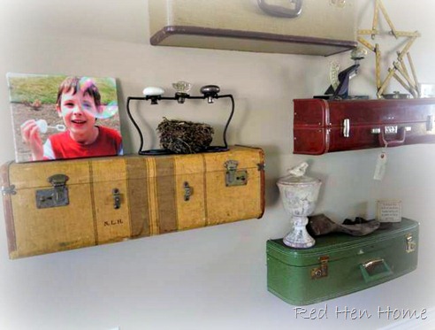
Among other changes I have been making in our home, I decided the suitcase wall needed a little updating.  Can you see the difference?  (You can see its debut—and the “how to--here, or its Christmas look here.)

house projects 021

Look down….look down…look down…

shutters 011

Yep, the little green suitcase is a new member of the family!  I never did figure out what to do with the awkward space at the bottom…so I put a suitcase in it!

Then I moved around some of my favorite vintage goodies, and added a bird nest or two…  (And notice the canvas I had made of Bubble Boy!)

shutters 012

shutters 013

It’s probably hard to tell, but the wall color is actually different (more on that later).  It took me a long time to work up the nerve to paint the suitcase wall!  I had to take all those suitcases down…then put them all back up…  Ugh!

shutters 010

Since I had to go through all that trouble anyways, it seemed like a good time to cut another suitcase in half!

shutters 009

**********************************************

This project was featured at My Repurposed Life and Elizabeth & Co..

************************************************

Linking up here:
Coastal Charm’s Nifty Thrifty Tuesday Elizabeth & Co.
Mod Vintage Life No Minimalist Here’s Open House Thursday
Friday Remodelaholic 2805
My Simple Home Life’s Simple Creations Friday Miss Mustard Seed’s Furniture Feature Friday
Funky Junk’s Saturday Night Special The DIY Show Off
Primitive & Proper Thrifty Décor Chick
  My Uncommon Slice of Suburbia
Perfectly Imperfect {Primp}
Simply Klassic Sundays My Repurposed Life
From My Front Porch to Yours It’s So Very Cheri
Common Ground {aka} design

Wednesday, May 9, 2012

Chelsey’s Bookcases

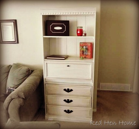
My friend Chelsey has had these Grandma-bookcases (literally) for quite some time now.  Probably two years ago we talked about the “how-to’s” of painting them—but this year, she finally decided to just have me do the work!

house projects 028

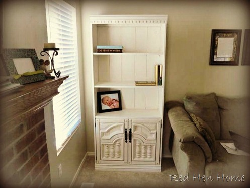
The bookcases have some really pretty details on the doors and on the crown molding.  The right one is actually more of a “secretary” with a pull-down work surface.

Chelsey thought all the brown was bringing her living room down, so we went white!

She may not know it, but the white I used is the same color that is on the trim in my house!  When you find one that works, I say, stick with it!

chelsey 001

I will admit that this was NOT my favorite project.  Unfortunately, the main construction of these pieces is laminated particle board, and it did NOT want to be painted!  It took one coat of primer (which obviously wasn’t sufficient) and FOUR coats of paint to cover!

chelsey 004

I used a dark-brown glaze (antique walnut stain mixed with Martha Stewart glazing medium) to bring out the pretty details.  Plus, there was lots of “natural distressing” on these pieces already—the glaze makes it look like it’s on purpose!

…and I played with PicMonkey’s “Urban” effect for the following pictures!

chelsey 003

I miss Picnik—I felt like I was just starting to get the hang of it!  But PicMonkey is very similar, so that’s good—for me!

chelsey 006

Anyway, I think we brought Grandma’s furniture into the new millenium!

**********************************************

This project was featured at Decorating Insanity.

***********************************************

Linking up here:
Coastal Charm’s Nifty Thrifty Tuesday Elizabeth & Co.
Mod Vintage Life No Minimalist Here’s Open House Thursday
Friday Remodelaholic 2805
My Simple Home Life’s Simple Creations Friday Miss Mustard Seed’s Furniture Feature Friday
Funky Junk’s Saturday Night Special The DIY Show Off
Primitive & Proper Thrifty Décor Chick
Decorating Insanity My Uncommon Slice of Suburbia
Perfectly Imperfect {Primp}
Simply Klassic Sundays My Repurposed Life
From My Front Porch to Yours It’s So Very Cheri
Common Ground {aka} design