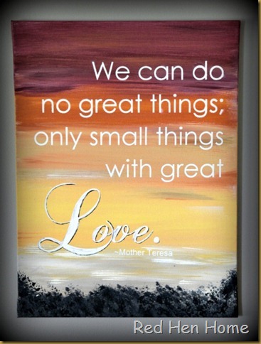
It’s well known that I love signs and quotes in all their varieties (you can see my Etsy shop if ye doubt). I’ve been pondering ways to make mine unique and separate from the many other lovely versions that are available. I thought about using some ombre backgrounds, and that idea morphed into this:
Here is an 18” x 24” canvas that I painted Sunday night. “What is it?” you may rightly wonder! Well, lacking the skills to actually make a painting that looks like something…I decided to settle for reminding you of something!
To me, the reds, yellows, and oranges are reminiscent of a sunset. But I suppose it could be a sunrise, too...although if it is, I keep thinking, “Red sky the morning: sailor take warning!” And I don’t even sail!

I over-laid the scene with a favorite quote from Mother Teresa:
“We can do no great things; only small things with great Love.”

I used my Silhouette to cut the lettering out of vinyl for this project. I used the negative space for the canvas, which left me with the “positive” space for another go.
This time I applied the quote to a piece of beadboard, and then painting another sky scene right over top of it all. This time I used many different blues, as well as black, white…and a little pink. Is it sunrise? Is it dusk? I’ll let you decide!

I can’t really decide which I like better. I like the softly faded, worn look of the beadboard (I had to distress it a little, naturally).

…but vibrant reds and oranges speak to me, always!

Which one do you like?
(and if you really like one…they are both available in the Etsy shop.)
***********************************************
Linking up here:

They both look great. But my fav is the blue one!
ReplyDeleteHolly
these are very cool- love this idea!
ReplyDeleteI am a color fanatic! So, when I saw these signs with COLOR I fell in love!!!
ReplyDeleteI love them both,I would have to buy both!
I tell my grandkids that same sailor saying ;)
My hubby had never heard it before, isnt that strange..lol.
have a great day,
~Diane
I'm not sure I could choose which one I like because I like them both! I love sunrises and I love sunsets and my two favorite colors are red and blue which you use in both so... I'd say do the two back ground side by side with two different (but complimentary) messages. :D
ReplyDeleteThese are just great. I like them both I think they are beautiful.
ReplyDeleteCynthia
Korrie,
ReplyDeleteThey both look amazing....but I think I like the orange one better! You are so talented!
blessings,
karianne
Love them both! The bead board is my favorite, however, the reds/oranges are my colors. :)
ReplyDeletexo
Pat
How come we have to pick? can't we just love them both? Hope you are feeling better, sweetie.
ReplyDeleteHugs,
Laura
They are both simply gorgeous!
ReplyDeleteThese are simply stunning! I particularly like the blue one, because I'm more partial to blues, but for a really great punch of color in a space, the red one is perfect!
ReplyDeleteI love that quote, and your painting talent shines in your post.
ReplyDeleteThese are beautiful, Korrie! Love the quote! Great inspiration! Thank you for sharing your project at Potpourri Friday!
ReplyDeleteDon't you love this quote from Mother Teresa? I do! Both of your signs are just lovely! The blues would go nicely in my home! Wonderful post!
ReplyDeleteLove that quote!
ReplyDeleteThey are both beautiful and I like the quote too, you've done a lovely job!
ReplyDeleteI love anything with a Mother Theresa quote on it! Thanks for sharing!
ReplyDeleteKorrie--I love your signs! they are so beautiful!
ReplyDeletegail